Question 1: In what ways does your media product use, develop or challenge forms and conventions of real media products?
I have chosen some of these images below to help influence my final film. I have taken some screen images from other horror film and horror psychological films that show the typical conventions of my sub genre. I have compared these shots with images of my own to show how they have influenced my film.
This is a Warner Brother logo for the opening of there films. This logo personally feel like its made for a horror as the use of the black and white colors. I like this logo because the use of the color white can be used to imply sterility as doctor and nurse wear white which is related to death. Also the use of black is very dominant which allows us to see that there evilness involved. In the background of this logo I also like the use of clouds as it calmly bring the whole logo together as one connecting with the font which i also like as it is basic. Warner Brothers logo is very interesting as this is how i want my logo to look as it could represent my opening to a horror film.
Here is my opening logo for our horror film 'What Doesn't Belong'. The film company is called Shadows as it is related to darkness, mysterious and creepy name. To make this logo we had taken ideas from Warner Brothers by using the colors black and white but also a use of red to make it create a scary look as our company was all about creating horror films. At the start I liked Warner Brother logo as it was smooth but could also relate to everything from a horror to a children's film but in the end i taken inspiration from Universal. The reason is because there logo was more catchy as they use the imagine of the globe to say that they are aiming films at everyone but we chosen to get a old map of England in the background to symbolize we are aiming at the English so we combined the two logos by using Warner Brothers colors and Universal idea of the globe.
This title used is very simple and basic as it just has the use of the 2 colors (white and red) and also a picture of the mask in the back ground sunk into black. This logo is great as the red represents death, danger or blood then the use of black tells us and represent the evil, darkness and fear. The font used is also basic which allows it to stand out but as the ghost face mask is in the background, this allows us to create tension as we feel like were being watched. This logo of scream is also inspiring as this is what I would like my logo to look like as its basic but on the other hand interesting as it represents a lot with only a limited amount of colors words and images used.
This title used is very simple and basic as it just has the use of the 2 colors (white and red) and also a picture of the mask in the back ground sunk into black. This logo is great as the red represents death, danger or blood then the use of black tells us and represent the evil, darkness and fear. The font used is also basic which allows it to stand out but as the ghost face mask is in the background, this allows us to create tension as we feel like were being watched. This logo of scream is also inspiring as this is what I would like my logo to look like as its basic but on the other hand interesting as it represents a lot with only a limited amount of colors words and images used.
Here is the logo for our psychological horror that appears in the titles of our film. I have tried to follow the colour same colour scheme as Scream but using 3 colors to create a horror effect. In this imagine we can see the horror effect as we have the use of a red hand to relate to blood and danger but also the use of black which is sunk into the brown which represents evil, darkness and fear as it does in Screams logo. Am very impressed title sequence because it as the effect I wanted it to have as it looks scary but also the use of the book page in the back ground relates to the opening of our film.
This is a image of a scene from my sub-genre 'Paranormal activity 2' were a lady is being controlled by demon, making her stand in the middle of the bathroom doorway. A couple minutes later the film fast forwards by 2 hours and the lady hasn't moved a inch still standing still which tells us that the demons and spirits are power. The camera is at an high angle which makes the lady seem even weaker and also as this film is made by a hand eld camera and there is a timer in the bottom corner, it makes it seem more realistic as this is how a camera we would us would look.
This is a image of a film from an existing zombie film called 'Blade trinity' staring wesley snipes. This film is about a character called blade who is a half vampires who learns to fight to kill all the bad vampires. As we can see from this imagine, blade is a strong character from the muscles he has to the anger expressed on is face and the bullet proof vest which imply to us that he comes close to death. Also as the camera is slightly at a low angle, it also allows him to seem more power.
This is an example of mise-en-scene from the film 'The strangers'. This film is about a family stalking a couple trying to kill them because they have been living in there house. In this scene we see family threatening the couple who are sitting down. In this scene the costumes are very powerful as they all have masks on to hide there identity and also the man's mask is different to the others which singles him out and also he is wearing a suit which could imply and tell us that he is a very serious or important person. In this imagine we can see that the woman on the right as A big kitchen knife in her hand which could be used to kill the couple and also as the couples are sitting down, it also allows the family with masks to seem more power full. Also there body language is formal and relaxed which also imply that there not scared and may of done it before. From this angle of the camera, its looks like there in the middle of no were which tells us that there not going to be a hero or a rescue coming.
This is an example of mise-en-scene from our film. In this imagine we can see that there is a lady walking through a forest. This shots shows the background of the location the lady is in and we can see that it relates to the imagine above as both victims are in an isolated area where there is no help but just danger. It creates a sense of being a lone which relates to the theme of the film of a physiological horror.
Four images from an existing film (The Strangers):
This is an imagine that establishes the character as weak and scared. From this shot we can see that it relates to girls being weak compared to males as Wesley Snipes looks angry and ready to fight how every this character Annabel looks frightened and scared as she in hiding behind a tree. This is a great imagine when establishing and showing the true character of the actor as we have made her seem the weakest and scared as it is also a high angle which tells us that what every is bothering her is stronger than she expected.
Four images from an existing film (The Strangers):
This is a power image as we see a long shot of a female sitting beside her bed holding a knife. From this imagine we can tell that this is a horror film as the lady is looking scared and also she has a knife in her left arm which tells us that she could be in danger and may use it which then relates to stabbings or death. Also her skin is very pale and on the floor next to her there is mess which tells us that she is not in a good environment.
This is a low angle close up of Annabel holding rosary beads. From this imagine we can tell that Annabel is scared as these beads are related to christians praying, maybe for help. The idea of this imagine came from inspiration from the imagine above as both girls are in a similar situation and need help but the lady above protects her self using knifes how ever Annabel prays to God for help.
This is a powerful imagine as it is a close up of the character Annabel. The reason why i think this picture is powerful is because like the picture above it allows us to see all the facial expressions. As seen in the image the facial expressions tell us that were looking at a character who is scared of something but also may be crazy as her make up is a mess and around her eyes look black but her eye balls look like they are focused on something but what?
This is a mid shot of a lady on her hands and knees crawling a long the floor. This is a power full image because the use of the mid shot allows us to see the ladies facial and body expressions but it also allows us to see part of the back ground which doesn't look like the best place to be as it is dark and there a trees which both come across as creepy. Also as she is in the imagine alone this instantly make us think she is scared and that could be the problem.
This is a low angle close up of Annabel holding rosary beads. From this imagine we can tell that Annabel is scared as these beads are related to christians praying, maybe for help. The idea of this imagine came from inspiration from the imagine above as both girls are in a similar situation and need help but the lady above protects her self using knifes how ever Annabel prays to God for help.
This is a mid close up of a man which instantly highlights the psychological genre. This is because from looking at his facial it instantly tell us that he feels unsafe has he is looking to the right with a paranoid face is if something is there. Also in the background we can see loads trees and a vandalized car which allows us to think that someone is out there and also as he has a knife in his hand we suspect that something is happening or is about to happen.
This is a mid close up of a Annabel which instantly highlights the psychological genre. This is because from this imagine we see the character on the floor leaning against the tree. In the background we can see more trees but also tree on the floor which tells us that it could be bad weather as a tree may of been blown over. These two character can relate as both imagines make us think thats both characters are in a vandalized or creepy place but also they are also both alone and by looking at there facial expressions we suspect that someone or something is out there looking for them.
This is a mid close up of a Annabel which instantly highlights the psychological genre. This is because from this imagine we see the character on the floor leaning against the tree. In the background we can see more trees but also tree on the floor which tells us that it could be bad weather as a tree may of been blown over. These two character can relate as both imagines make us think thats both characters are in a vandalized or creepy place but also they are also both alone and by looking at there facial expressions we suspect that someone or something is out there looking for them.
This is a powerful imagine. The reason is because it instantly makes the audience think. This is because as it is a close up, it allows us to see the characters emotions and this character as worried emotions as it highlights her facial fear. I think this because he facial language looks like something is wrong and there is nothing she can do about it. Also as she is in the imagine alone this instantly make us think she is scared and that could be the problem.
This is a powerful imagine as it is a close up of the character Annabel. The reason why i think this picture is powerful is because like the picture above it allows us to see all the facial expressions. As seen in the image the facial expressions tell us that were looking at a character who is scared of something but also may be crazy as her make up is a mess and around her eyes look black but her eye balls look like they are focused on something but what?
This is a mid shot of Annabel running. The reason i have chosen this shot is because i think the imagine is powerful. The reason is because in the imagine we get ever thing we need to know thats she in trouble such as the creepy background and the facial expressions on her face. I can also relate this imagine to the imagine above as it seems if both ladies are in the same situation and there both trying to escape as Annabel is running away and the imagine above is trying to do the same thing but hide at the same time.
Question 2: How does your media product represent particular social groups?
Representation shows the stereotyping of how characters are and how they behave. The character represents the weaknesses by following the stereotype, in these videos we can see that the woman and young boy both appear to be very weak and vulnerable. This could be because woman are usually seen as weaker then male and also the younger you are the more weaker, vulnerable and innocent you seem so that in its has instantly built a stereotype of how we see charters.
From this trailer paranormal activity 3 we can see that this film is aimed at the older age group. This is because the film is about ghost which may be scary for the younger age groups. Also throughout the trailer we can see that this film as a stereotype against girls and younger age groups. This is because the have he most screen time and also we hear a lot of screaming coming from them. The use of the two little girl is also very power as we feel sorry them instantly even before anything happens. So far throughout the trailer woman as seen as the victims because there he only people we see and also at 26 seconds we see a lady being dragged out of the baby bedroom which also could be a stereotype of woman being weak.
It is important to know who your target audience is and that is why in our media film we have chosen to give our film a rating of 15 which means that no one below the age of 15 can watch it. This is because it allows us to use strong language and maybe violence. This means that anyone the age of 15 or above can watch this which is great because throughout the research I have done, i have found out that mainly people the age of 18-21 are the most popular people for watching psychological horrors but as some younger teenagers also like to watch psychological horrors we also chose to aim our film at them aswell which would be a good would be a good cimbination of people to aim at. Also by doing other research such as watching psychological horrors I found out that they mainly contained males as there main character but in our media film we are going to have a girl as the character which will allow us to aim at a wider variety which will allow all the 18-21 males to watch it but also females as it will attract them because of the character being a female. In our film the main audience will be females and males the age 15 and above. 
Representation shows the stereotyping of how characters are and how they behave. The character represents the weaknesses by following the stereotype, in these videos we can see that the woman and young boy both appear to be very weak and vulnerable. This could be because woman are usually seen as weaker then male and also the younger you are the more weaker, vulnerable and innocent you seem so that in its has instantly built a stereotype of how we see charters.
This is a clip from a psychological horror called IT the clown. This scene shown is about a little boy called Georgie who is trying to get his paper boat back before being kidnapped by a clown. In this clip shown we instantly see that there is a victim and a bully. During this clip, we instantly see that the challenge the stereotype of age groups. This is because they are seen as weak and in this clip, the young boy is seen as weak as he is easily dragged in the water wastage hole. Also it challenges the stereotypes that young people are vulnerable and they would do anything for sweets as they normally would. I say this because at the start the clip the boy say he must not talk to strangers untill he hears the clown talking about bloons and candy and quickly changes his mind and decides to talk.
From looking at both of these clips it can be shown and seen that the two clips have a major stereotype against the younger age group as they are put across as weak. This is great because it instantly tells me that during films character are seen as to be weak if they are girls or young. Also from looking at these clips I realised that as my character is a girl, this will make her be seen as weak but by giving her more screen time it will make the audience feel sorry for her more and create more feelings for the character which will upset the audience or create more of a fright to them if something happens to her.
Feedback: When i was look through our feedback we received from our our class memebrs after they had watched the film. This was helpful to me and my group members as no one felt as if we had a negative representation of any of these social groups. We aimed to have a neutral or positive representation so that our film appealed to a large audience. Overall we found that we had some good feed back as people were happy with the film and that they felt it fell in with the correct genre and age group.
Question 3: What kind of media institution might distribute your media product and why?
However the release date for the DVD will be different as we want as many people as possible to watch it in the cinema's first we have decided we want the DVD to be available on the 26th of December (boxing day). The reason for this date is because after doing research we have found out that DVD's tend to come out roughly 3-5 months after being shown in the cinema. Also this means that if the DVD takes a while to come out, people will be more excited to buy it but also as it is the day after christmas this will mean that people will hopefully have to money to be able to buy the film on DVD.
Feedback: When i was look through our feedback we received from our our class memebrs after they had watched the film. This was helpful to me and my group members as no one felt as if we had a negative representation of any of these social groups. We aimed to have a neutral or positive representation so that our film appealed to a large audience. Overall we found that we had some good feed back as people were happy with the film and that they felt it fell in with the correct genre and age group.
Question 3: What kind of media institution might distribute your media product and why?
This is a poster taken from a psychological film called Saw. The reason i picked this poster is because i find it inspirational because of the colour sequence and the imaged used. This is because the black used instantly creates a message of evilness and with the red involved it also tells instantly creates a imagine of danger or blood. Straight away this poster is great because just by looking at the poster colours we can create though and images or scary things happening which is great but it allows us to be sacred even before the film as started. Also the imagine used is a mid close up of a man with is head in a box. This image is powerful because as its a mid close it we would expect to see more detail but as he can't see this detail yet again it make use instantly think about band things that could be happening to him inside that box. With the image and text put together this is an excellent combination because it create an imagine of horror and thought as it makes up naturally think and be scared automatically.
Release Diary:
The release date I have chosen for our film is the 25th September 2012. Our team have chosen this date as after researching the dates of when the Oscar awards are hosted, I found that it is mainly hosted in February or March. I also looked at many films that have won the 'Best Picture' award and the majority of them have been released late in the previous year (Sept, Oct, Nov, Dec). That is my reason for choosing the 25th September, however another reason is that it provides time for planning and refilming incase any thing doesn't flow, such as if the continuity of the video isn't right. This means that if our group has extra time spare on our hands before September and everything is sorted out correctly we can use this time to create extra's such as posters or to even bring out a last trailer ect..
The release date I have chosen for our film is the 25th September 2012. Our team have chosen this date as after researching the dates of when the Oscar awards are hosted, I found that it is mainly hosted in February or March. I also looked at many films that have won the 'Best Picture' award and the majority of them have been released late in the previous year (Sept, Oct, Nov, Dec). That is my reason for choosing the 25th September, however another reason is that it provides time for planning and refilming incase any thing doesn't flow, such as if the continuity of the video isn't right. This means that if our group has extra time spare on our hands before September and everything is sorted out correctly we can use this time to create extra's such as posters or to even bring out a last trailer ect..
However the release date for the DVD will be different as we want as many people as possible to watch it in the cinema's first we have decided we want the DVD to be available on the 26th of December (boxing day). The reason for this date is because after doing research we have found out that DVD's tend to come out roughly 3-5 months after being shown in the cinema. Also this means that if the DVD takes a while to come out, people will be more excited to buy it but also as it is the day after christmas this will mean that people will hopefully have to money to be able to buy the film on DVD.
Question 4: Who would be the audience for your media product?

This logo means that this film is only suitable for people the age of 15 or over. Also no one younger than 15 may rent or buy this film. The reason is because at this age level films start to use more strong language more frequently. Also the use of drugs may be seen different as character may take some but this is acceptable as long as the promote or encourage drug using. Also violence and nudity may be shown but not in as much detail as an 18 ect..
This logo represents that no one under the age of 18 may watch, rent or buy this film. The reason is because they have more less have no restrictions which means more strong language, more sexual scene showing more flesh and more scenes which may accidently give out the wrong promotion.
As you can see that there is two different logos which tells us that there is a difference in films. During an 18 year olds film you are likey to see a change in the way characters behave as they are more free to swear and also have the advantage of doing more things were as in a 15 year olds film they are limited with in what they are allowed to do.
From this trailer paranormal activity 3 we can see that this film is aimed at the older age group. This is because the film is about ghost which may be scary for the younger age groups. Also throughout the trailer we can see that this film as a stereotype against girls and younger age groups. This is because the have he most screen time and also we hear a lot of screaming coming from them. The use of the two little girl is also very power as we feel sorry them instantly even before anything happens. So far throughout the trailer woman as seen as the victims because there he only people we see and also at 26 seconds we see a lady being dragged out of the baby bedroom which also could be a stereotype of woman being weak.
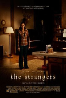
Film: The strangers
Certificate Age: 15
Rated: 6.1
Film: The Others
Certificate Age: 12
Rated: 6


Film: Paranormal activity 2
Certificate Age: 15
Rated: 7.7/10

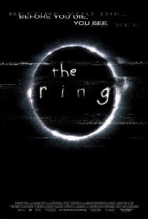
Film: The Ring
Certificate Age: 15+
Rated: 7.1/10

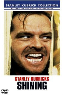
Film: The shinning
Certificate Age: 15+
Rated: 8.5/10
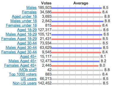

From this information we can see that these psychological horror are watched by mainly males aged 15+ but also the odd 12 year olds films. As most psychological horror aim roughly at the same age group, this instantly tells me what a good age group is to aim at when creating a psychological horror.
Question 5: How did you attract/address your audience?
As a group when we was planning our film we was thinking about what would scare the audience and what would they enjoy but to start of with we had to do some extra planning to find out who our target audience would be. We did some reseach and found out that main and most people who watch horror films are aged 18-21 but also the odd 15+ year old tend to also watch horrors also. When making the film we wanted to it to be a film that the audience enjoys so we decided to add spookie parts that make the adience jump in fright so when that when we ask them if they enjoyed the film they can say 'yes it was very spookie and scary'. When the audience watch our film we would want them to see scary, bloody and gory parts which would be in any other horror film.
Also when creating the film we had to think about what age group to aim at. We had to take in to consideration that if it was aimed at 12 years olds + we would have to make sure that it was appropriate for them to watch but also if we aim it at 18-21 but also 15+ this is good because it allows us to use strong language and maybe violence. This means that anyone the age of 15 or above can watch this which is great because throughout the research I have done, i have found out that mainly people the age of 18-21 are the most popular people for watching psychological horrors but as some younger teenagers also like to watch psychological horrors we also chose to aim our film at them aswell which would be a good would be a good cimbination of people to aim at.
Another thing we had to plan was that were we going to locate our film and also what props we was going to use to make our horror film more realistic. We decided the location of our film would be Wollaton Parks forest. The reason for this is because it would fit in perfectly with our genre as the woods are creepy, big but also dark. This way we create more of a tense and spooky film which would effect how the film looks a lot. Also to make the film more tense and spooky we decided to use a lot of props such blood to make the film more gory, we used a lot of make up on our character to make her look ill and dangerous. Also we used to a scary glove which is long to make the audience get a little but frightened. This will help connect with the audience because it will allow them to be more scared and also when the see the character look mad and scary and also when they see the hand with long fingers it will hopefully scare them.
When making the film we also remembered we had to make a tittle sequence to introduce the actors and directors etc.. The reason we did this was because we wanted to engage with the audience from the start such as by slowly creating tension from the music we have used but also from the back ground images and short clips of the cross and the books on fire etc..
To add more fright to the film as a group we also decided to create music to give the film that extra bit of horror. To make the music/sounds we used garage band which helped us a lot as there we many sounds and instruments to choose from to help us. The music we created is spooky and quiet. The reason is because we just wanted to as background music just to help us add more tension to the horror film. The sounds we used are also there to indicate that some thing is also going to happen to the victim.
 After creating the final psychological horror as a team we was being optimistic which meant we couldn't see nothing wrong with our film and though that everything was perfect so to see if we was right we decided to ask the class to watch our film and give us some feed back. After the feed back we received we was very happy with what we created as class members gave us great replies such as saying our film fits in with the level 4 boundary or that they found our film spooky which its supposed to be. This was good because it make it believed that our film was successful and fell into the correct age group and category. his is because it allows us to use strong language and maybe violence. This means that anyone the age of 15 or above can watch this which is great because throughout the research I have done, i have found out that mainly people the age of 18-21 are the most popular people for watching psychological horrors but as some younger teenagers also like to watch psychological horrors we also chose to aim our film at them aswell which would be a good would be a good cimbination of people to aim at.
Also when creating the film we had to think about what age group to aim at. We had to take in to consideration that if it was aimed at 12 years olds + we would have to make sure that it was appropriate for them to watch but also if we aim it at 18-21 but also 15+ this is good because it allows us to use strong language and maybe violence. This means that anyone the age of 15 or above can watch this which is great because throughout the research I have done, i have found out that mainly people the age of 18-21 are the most popular people for watching psychological horrors but as some younger teenagers also like to watch psychological horrors we also chose to aim our film at them aswell which would be a good would be a good cimbination of people to aim at.
Another thing we had to plan was that were we going to locate our film and also what props we was going to use to make our horror film more realistic. We decided the location of our film would be Wollaton Parks forest. The reason for this is because it would fit in perfectly with our genre as the woods are creepy, big but also dark. This way we create more of a tense and spooky film which would effect how the film looks a lot. Also to make the film more tense and spooky we decided to use a lot of props such blood to make the film more gory, we used a lot of make up on our character to make her look ill and dangerous. Also we used to a scary glove which is long to make the audience get a little but frightened. This will help connect with the audience because it will allow them to be more scared and also when the see the character look mad and scary and also when they see the hand with long fingers it will hopefully scare them.
When making the film we also remembered we had to make a tittle sequence to introduce the actors and directors etc.. The reason we did this was because we wanted to engage with the audience from the start such as by slowly creating tension from the music we have used but also from the back ground images and short clips of the cross and the books on fire etc..
To add more fright to the film as a group we also decided to create music to give the film that extra bit of horror. To make the music/sounds we used garage band which helped us a lot as there we many sounds and instruments to choose from to help us. The music we created is spooky and quiet. The reason is because we just wanted to as background music just to help us add more tension to the horror film. The sounds we used are also there to indicate that some thing is also going to happen to the victim.
 After creating the final psychological horror as a team we was being optimistic which meant we couldn't see nothing wrong with our film and though that everything was perfect so to see if we was right we decided to ask the class to watch our film and give us some feed back. After the feed back we received we was very happy with what we created as class members gave us great replies such as saying our film fits in with the level 4 boundary or that they found our film spooky which its supposed to be. This was good because it make it believed that our film was successful and fell into the correct age group and category. his is because it allows us to use strong language and maybe violence. This means that anyone the age of 15 or above can watch this which is great because throughout the research I have done, i have found out that mainly people the age of 18-21 are the most popular people for watching psychological horrors but as some younger teenagers also like to watch psychological horrors we also chose to aim our film at them aswell which would be a good would be a good cimbination of people to aim at.
Film Ratings (BBFC):
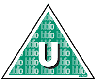
This logo shown represent that a film is suitable to be watched by people over the age of four. The logo also represents that this film will not contain any scenes including drugs, violence, horror, threat or sex unless there is a clear message explaining to people watching the film that these things are wrong to do and shouldn't be done.
This logo PG as known as parental guidance means that this film is for general viewing as it is allowed to be watched by a child unaccompanied however it is up to the parents to decide if the child may watch the film as it may include content which may upset the younger or more sensitive children. In a PG they may contain tame bad language, natural nudity, soft violence without detail ect...
This logo represent that this film may not be watched by anyone under the age of 12. This is because at this age films start to use more sex, drugs, violence and also strong language such as 'fuck' but on the other hand they don't take advantage of this opportunity by making sure materials and words used are suitable for those aged 12.
This logo represent that this film can be watched by a person the age of 12 as long as they are accompanied by an adult. This is because at this age films start to use more sex, drugs, violence and also strong language such as 'fuck' but on the other hand they don't take advantage of this opportunity by making sure materials and words used are suitable for those aged 12 who are less sensitive and more grown up.
This logo means that this film is only suitable for people the age of 15 or over. Also no one younger than 15 may rent or buy this film. The reason is because at this age level films start to use more strong language more frequently. Also the use of drugs may be seen different as character may take some but this is acceptable as long as the promote or encourage drug using. Also violence and nudity may be shown but not in as much detail as an 18 ect..
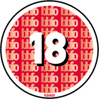
This logo represents that no one under the age of 18 may watch, rent or buy this film. The reason is because they have more less have no restrictions which means more strong language, more sexual scene showing more flesh and more scenes which may accidently give out the wrong promotion.
The 'R18' is a restricted category which can only be brought and watched in licensed shops and cinemas as it contains detailed sexual parts. The reason is because these films may give out the wrong message and may make some of the young sexually active.
Through out this research me and my group members decided to give our film a age rating of 15. This is because as we want our film to be open to most people we worked it out that as our film doesn't contain loads of strong language and no fleshy or sexual scenes we realized that our film could be watched by people under the age of 18. On the other hand, through out our researched we found out that as 12 year olds are not teenagers and still may have sensitive feelings, as our film is a horror and it will contain some upsetting or maybe scary scenes we decided that it would be more appropiate to aim it as 15 year old as there feeling and emotions may be stronger.
Question 6: What I have learnt about technologies (prezi)
What I have learnt about technologies from the process of constructing the product on Prezi
Question 7: Evaluation


.png)


No comments:
Post a Comment