Question 1: In what ways does your media product use, develop or challenge forms and conventions of real media products?
This question looks at comparing existing films to our own so that we are able to look at how our film contrasts or is similar to stereotypical horror conventions. To be able to do this I have posted various images from other films including logos, stills etc and from this ill be able to compare these images to ones from my own film and see if we have done the same to create the horror genre. In doing this I will receive a better prospective on horror conventions.
This question looks at comparing existing films to our own so that we are able to look at how our film contrasts or is similar to stereotypical horror conventions. To be able to do this I have posted various images from other films including logos, stills etc and from this ill be able to compare these images to ones from my own film and see if we have done the same to create the horror genre. In doing this I will receive a better prospective on horror conventions.

Logo: Known for the Saw movies, Twisted Pictures is a company that produces horror movies. The film logo is quite basic in form compared to others however its use of rusty in appearance barbed wire twisting round a metal pole stands out clearly towards the viewer due to its' obvious relation to horror. The text 'twisted pictures' is covered up by the darkness of the black background and has scratches throughout the font, this suggests a violent and graphic nature which relates once again to the genre of films this company creates. The dark background is useful as black has connotations of horror within this genre as film companies often use dark colours and shadows to create fear as there is often an existance of a dark and 'twisted' presence. This is a useful logo as it instantly tells us what type of film this company makes and gets us into the horror mood when seeing it.
 Our Logo: As it was so clear from looking at the Twisted Pictures logo that it was a horror film company, we felt we needed to create our logo in a way that also revealed to the audience the nature and intentions of our company. As a shadow is associated with darkness, we believe these connotations will relate to horror and fear. Not only this, I think the idea of shadows relates mostly to a psychological sub-genre as it implies the presence of something unknown lurking in the distance. Using blood in the background allowed us to further enhance the idea that our company produces horror films. I think the black background allows the font to stand out and the fact that the font style used is almost symbollic of the style of writing seen in films in ancient texts, spells, rituals etc allows the writing to have its' own element of horror and creativity towards it.


Film Titles: Here is the film title for movie 'The Shining' in which various screen shots show the overall shots in the title. The title sequence has a large focus on mise en scene as the location plays such a vital role in this sequence as it displays a small car driving around mountaneous, meandering roads which are completely isolated. The location itself seems quite eerie with its still and quiet atmosphere as it seems no life belongs there. This highlights the conventions of horror as the feeling of uncertainty and fear always has to be maximised to create the best audience response. Music also plays an important role as the music is quite dark and gloomy and it dooms in as the car drives around. The music used is a perfect association with the images shown as it helps to reinforce the fear that is created from the eerie atmosphere. The fact that the vehicle is always driving close to the edge of a mountain provides a sense of danger which is also a stereotypical factor of horror and it also mirrors the film storyline as the main character who ends up suffering from insanity is also close to the edge in terms of turning mental at the beginning of the film.
 Our Film Titles: The film titles we have used show a burning book which reveals the text of names, productions etc. We created this image because we wanted a common horror theme throughout our titles and to us, the idea of a burning book to reveal the titles was a good symbolisation of horror as fire is associated with danger and fear. This relates to our sub genre because it pre-warns the audience that danger is upon the character. The words used also help to provide connotations of fear, for example 'Reaper' instantly triggers the idea of the Grim Reaper aka Death, this implies a great misfortune is to happen within the film and doing this sets the mood instantly for the audience.
 Image from existing sub-genre: The image shown is a still image from film Paranormal Activity, it shows a couple in bed appearing to be quite scared and the woman is pointing at a shadow on the door. The typical horror conventions shown within this film for our sub-genre is the feature of shadows as it implies something else is present and exists amongst the victims and this is quite scary as we dont know who this shadow is and what it wants. Not only this, this image is shown at night time which once again is quite good at providing fear as during night time people are seen as vulnerable as it doesnt feel as safe as day time due to the fact that darkness allows people to hide. Not only this as they are quite obviously meant to have been sleeping, the fact it is dark means that any sound could wake them up as it would be an unexpected presence. The use of a time featured in the bottom right corner allows the film to be realistic as because it is meant to be filmed on home cctv cameras, the audience can feel fear as it doesnt seem faked.
 Our Image from an existing sub-genre: As our character Annabel is a psychologically disturbed person, we wanted to highlight how she would see disturbing things (such as the hand) to show her current mental state. As in the previous image, Paranormal activity focuses on a shadow to create fear, we tried to make the fear element even more real by implying an actual physical presence of this psychological villain that is corrupting Annabel. The shape of the hands, with their dagger like tips has connotations of horror as it is clearly an unnaturally shaped hand and the audience is left wanting to find out who this hand belongs to.
 An image that establishes character from an existing film:
This image from film 'The Ring' does a good job of establishing character as it instantly provides the viewer with the sense of something not being quite right about this character. Her long scruffy hair, face dropped body pose and menacing stare all tell the audience that the girl is obviously quite freaky and has an negative aspect about her. The costume and surroundings makes it clear to us that she is the main horror element within this film as it implies she has mental issues. The portrayal of this character is clearly focusing on horror conventions of how to create a scary character within a film.
 An image that establishes character from our film: This image (Taken from our title sequence) helps to establish character as we instantly see features that highlight her identity. Firstly, she is holding rosary beads which has connotations of religion, this helps reinforce that the villain within this film is possibly a devilish force trying to control her and destroy her faith. Also, the dark eyes on Annabel give the audience connotations of a physically drained, tired and possibly psychotic character. I believe we have established the character well to represent the psychological sub genre because of the focus on makeup and props.
 An image of mise en scene from an existing film: This image is from film Silent Hill which is set within an area with a lot of past history and it has countless amounts of ash pouring down due to the fact the village was burnt down years ago. The image shown works well at displaying typical conventions of horror as it is set in a dark and creepy environment which is what is expected of a horror film as darkness instantly tells the audience that the character will face something mysterious and evil. The location is important as the story of where they are and why they're there is one of the main issues of the film, the setting appears to be a derelict area which is rundown and abandoned, this too is typical of horror conventions as an abandoned area is usually associated with having something wrong and freaky about it. The lighting also plays a key role in this film as it is set in a very dark atmosphere with little lighting which is not beneficial at all for the victims as they are constantly hiding from monsters trying to attack them. As for body language, we see that 3 people are running together which suggests that they are a group of people working together against the enemy and trying to survive.
 An image of mise en scene in our film:
This establishing shot featured immediately after our title sequence ends, instantly shows us the mental institution from which our character escapes from. We wanted to pick a building which could depict an old styled mental institution as when looking at images of real institutions and remembering how they are depicted within films, they often are quite large and do have this castle, extravagant like appearance. The large open space gives a connotation of being isolated which is also how we wanted our character to be represented. I feel it relates to our sub genre as often, mental asylums do have this creepy and large appearance to them.
 This is an example of a real life mental asylum in Britain, as you can see, it is a very large, old building and this is what we tried to represent within our film in the chosen location.


This image from film 'The Ring' does a good job of establishing character as it instantly provides the viewer with the sense of something not being quite right about this character. Her long scruffy hair, face dropped body pose and menacing stare all tell the audience that the girl is obviously quite freaky and has an negative aspect about her. The costume and surroundings makes it clear to us that she is the main horror element within this film as it implies she has mental issues. The portrayal of this character is clearly focusing on horror conventions of how to create a scary character within a film.


This establishing shot featured immediately after our title sequence ends, instantly shows us the mental institution from which our character escapes from. We wanted to pick a building which could depict an old styled mental institution as when looking at images of real institutions and remembering how they are depicted within films, they often are quite large and do have this castle, extravagant like appearance. The large open space gives a connotation of being isolated which is also how we wanted our character to be represented. I feel it relates to our sub genre as often, mental asylums do have this creepy and large appearance to them.

Four images from an existing film (The Shining):

This image is effective as its useful in highlighting the psychological genre as instantly from looking at this persons facial expression it becomes clear that he has some mental issues and he appears very scary and creepy looking. In psychological horror you expect people to be mentally unstable and this tired, puffy eyed dark stare tells the audience this man is definitely dangerous. The entire appearance of this character stands out as unstable.

In this image we see a mid close up of the boy's face, this is quite an effective image and I have chosen to include it as I believe it is important for the audience to see reaction shots which highlight the character's fear towards something. This is typical to horror as it helps in making the audience feel scared and panicked as the characters are feeling that way too.

This photo is a mid action shot of a chase scene in which the character has axed through a door, he then peers through the door trying to torment his victim. This is a good image as we truly see the extent of this character's evil through his smile and menacing stare. It is important in horror to really let the audience know how evil the villain is and this is such a typical convention to show the audience a dramatic scene in which the victim is trying to escape.
 I believe this image shows a great example of how mise en scene can create fear. The body language and stance of these two young girls standing together staring at the audience is quite eerie and uneasy to look at. This is then highlighted by the use of dark red eye makeup to bring out their eyes in such a manner that to look directly at them is in itself a horrible aspect. This is a key image because it shows typical conventions of makeup within horror which help to create character and fear.
Four key images from our film:

This image (taken from the title sequence of our film) shows a high angle shot looking down onto the character. I find this image effective because it's one of the first images we see of 'Annabel' and it instantly makes the audience feel tense and aware of the genre of movie. I believe the strong use of shadow and darkness highlights her isolation and loneliness in this asylum and this raises questions about her mental stability. Connotations of shadows and darkness remain linked to the horror genre and i think the fact that her face is partially covered by darkness almost portrays how the dark force is taking over her. I believe the way in which shadows have been used in this image is quite beneficial in terms of adding effect because the audience becomes aware of the true environment that Annabel is in and they become aware of her psychological issues as she is rocking back and forth.

 This image is quite effective in establishing character and creating a tense atmosphere for the audience. The extreme close up of the character's eyes shows the defined features which establish her as a character. For example the black and red eyes indicate stress and insanity as the hollowness of her eyes imply that her as a character is 'empty' inside and has very little personality left. The fact her eyes are so strongly focused also adds fear for the audience. This was done because eyes moving frantically in a horror genre film are quite effective in creating fear because doing this reflects the insanity and unstableness of the character. An example of this is from the image featured at the top right from a horror film named 'Carrie'. The sharpness of the eyes is effective in creating fear for the audience. I believe the makeup used within this image is useful as it outlines aspects of the character's face which we as an audience can become aware of. For example, the dark and bold eyes and the strongly defined nose.
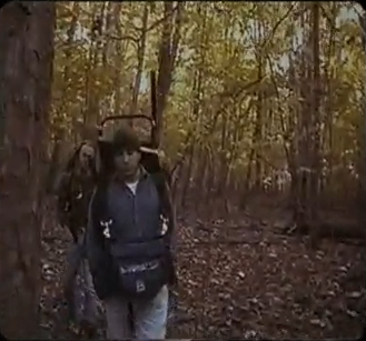
I believe the high angle positioning of this image provides not only the typical conventions of the character being weak, but I also believe it implies that the character is being watched as she walks through the woods. This implication of something unknown watching the character shows an existing convention that occurs in many horror films, this is why I find it quite an effective shot. I believe the audience will receive a sense of fear from this shot because it prepares them for the fact that something is about to happen as the positioning of the shot implies that the character is quite weak and less superior. The highlighting of her weakness as a character tells the audience that she has little chance to defeat the villain.

This final image from our film shows that the character has given in to the evil force and herself, turned evil. This still image shows the character wiping blood on her face. In doing this, the audience gets to truly see the extent of the character's insanity and in this single image, we as an audience fear for what the character might do next because the behaviour she is committing (wiping blood on her face) is unnatural and the instant connotation of this to the audience would be that she is truly psychotic and now a danger to others.
Question 2: How does your media product represent particular social groups?
My understanding of representation is of the way in which characters are depicted within films and the media as it then is able to plant an idea in the audiences head of how we see a certain character. Representation allows us to build stereotypes and have certain expectations for example when we see a female character within a horror film we instantly assume she is a vulnerable victim. This helps us in our filming as we can understand the importance of how characters should be depicted within our film, therefore it is important to analyse videos such as the ones below so that our group can individually receive a good grasp on what makes a horror.
My understanding of representation is of the way in which characters are depicted within films and the media as it then is able to plant an idea in the audiences head of how we see a certain character. Representation allows us to build stereotypes and have certain expectations for example when we see a female character within a horror film we instantly assume she is a vulnerable victim. This helps us in our filming as we can understand the importance of how characters should be depicted within our film, therefore it is important to analyse videos such as the ones below so that our group can individually receive a good grasp on what makes a horror.
This scene from Black Swan shows clearly that the victim within this film is a woman and her pale face within the footage suggests her innocence as a character. The threat established within this scene is her own personal mental stability as (if you've seen the film) you would know she becomes a victim to her own insanity in her strive for perfection. This is similar to our film as our film too questions the insanity of our main character due to her previous history of being in a mental hospital. The social group represented in this clip is females as the female character is the main victim throughout. The grouping of the threat also belongs to the character and her mental state. This is a typical stereotype as women are portrayed as weaker characters in horrors, possibly because this is more realistic for men and women who are viewing the film as it's more understandable to relate the victim to being a woman.
http://www.youtube.com/watch?v=rkoNw8kk_Ng
- This is a video link of film The Blair Witch Project. This is a film about a group of students filming a documentary based on the 'Blair Witch' but end up getting lost in the woods they are filming in and one by one they begin to disappear. The social group represented in this film are a group of young adults who are obviously in a friendship group. The threat is established within this sequence by isolating a group of people in a large area of woodland and leaving them defenseless against the enemy. The victims are shown as they slowly deteriorate in their mental health as unexplained, fearful events start to occur. This is stereotypical to horror as the victims have been isolated from the outside world and they are seen as defenseless against the enemy. This is a good way of creating fear for the audience.
How has your planning evidenced your understanding of social groups?


 The two images shown are an image from our film 'What doesn't belong' and an image from 'The Shining'. When looking at social groups, it is clear that often in horrors, women are seen as weaker and are therefore stereotyped to being the main victim within the film. To create this representation of a social group, we too featured a main female character as the victim and this seems more realistic to the audience because of the typical connotations of a female character in a horror. In the image from film 'The Shining', having a female character which is instantly seen as weaker than the threat because of her gender (and of course the axe shown in the picture) allows us as an audience to stereotype her as weaker, which means that when (in the case of The Shining) a female character survives against the villain, we as an audience feel proud because the character (despite being weaker) has beaten the enemy. We wanted to highlight this social group stereotype, so we too have used a female character.
Feedback: When observing the feedback we received from our peers after they had viewed our film was that overall, we had neutral representations of gender, race and age. This was beneficial to us as no one felt as if we had a negative representation of any of these social groups. We aimed to have a neutral or positive representation so that our film appealed to a large audience. One group stated that we had a positive representation of gender however the main feedback was that overall it was neutral. Two suggestions for age ratings were 15+ and 15-25, which I feel is pretty accurate considering our age rating for the film is a 15.
Question 3: What kind of media institution might distribute your media product and why?
My understanding of distribution is that it is the process of getting the product to its' customers. This can be done on an extremely large scale in some cases for example particularly in the distribution of music and film. Major film companies have the money and resources to promote their films on a large scale. For example major companies can release posters, advertisements and merchandise (dvds, soundtracks etc). An example of this is the film District 9 (Sony release) which had a huge marketing campaign around the world to advertise its' film. However, an independent company has a much smaller way of distributing its' films, an example of this is 'Wake Wood', which premiered at a film festival rather than having a widespread theatrical release.

Here is an example of the type of marketing that took place for District 9, this was seen in areas such as the UK and USA and was quite an effective way of promoting the film.
Research:

 'The Box' is a psychological thriller released first on October 29th 2009 in Australia. It was then released in the US on November 6th 2009. The film made a total gross of $32,924,206 and was released onto DVD on February 23rd 2010.


'Wake Wood' premiered at the Lund International Fantastic
Film Festival in Sweden in 2009. It then went on to appear in just four cinemas during it's limited theatrical release. It was then released onto DVD 3 days later.
Clearly, there is a major difference between how these films are being released, this shows how dominant major film companies are in distributing their films to their audiences as they make it almost impossible to avoid them. It is plain to see the independent film companies have to go through a harder and riskier process to try and get their films known on a large scale. The independent film 'Wake Wood' was released only 3 days after appearing in only four cinemas. This is a huge difference to the release of 'The Box' which had widespread theatrical releases and was available for DVD four months later.
Our film poster:
 Here is our film poster for 'What Doesn't Belong', we have decided to include our main character so that the poster can relate to the film. Typical conventions of a poster were put into place, for example the billing, title, name of the actor and release date. In sticking to the conventions, I believe we created an effective poster that, with the use of colour and images, stands out and catches the eye of the viewer. The orange colour of the font was used to match the hair of the person featured on the poster and this allowed us to stick to a solid colour scheme which resulted in quite an effective appearance. The face shows the character's eye and it stands out quite strongly because of its' boldness in the poster. The light reflecting upon the hair also provides quite a good effect as it highlights shadows amongst other areas and it also is on level with the text revealing the title and this is a nice feature that is included. The font we chose to use was quite bold and I believe because of this it stands out to the audience and makes an instant impact. The main inspiration for this poster was 'The Grudge' poster as we found it was extremely effective in both creating fear and establishing character.
Advertisement Campaign:
An example of how we could distribute our film if we were an independent film company is to enter the Bang Film Festival in Nottingham. This is a local short film festival which allows independent film producers to showcase their films. This would be a beneficial way to get our film across as an independent company as it wouldn't be as expensive as major company distribution yet it still gets some sort of an audience which helps to get a good reputation for the film.

Another form of the distribution would be to have our film poster put up in various locations such as on bus shelters, on buses, on billboards etc to help make the public aware of our film and when it's coming to cinemas. If we were a major company, this form of advertising would be easily done and would allow our film to receive a big audience because this form of promotion would make it well known by the time it comes to cinemas.
Another form of promotion would be the use of trailers. Depending on the success of the business, a trailer for our film could be used on mainstream TV channels which would mean that an incredibly large amount of people would become aware of 'What Doesn't Belong'. Not only this, we could also choose to feature our trailer in cinema before other films of the same rating (specifically horror). This would subject the viewer to an introduction of our film and if they are about to watch a horror film, this could indicate that they are horror fans, meaning that the trailer would allow the film to receive a good turn out for its' cinematic release as the trailers shown allow people to become aware of the film.
If we were an independent company, an effective and cheap form of promotion would be to advertise our film through social networking sites so that the audience can become aware of its' existance. For example, the use of Twitter or Facebook advertising would be extremely effective because of the large amounts of users that these sites have. An example of a similar form of this (although this was not done officially by film creators, instead it was done by a fan) is the 2012 film 'The Cabin in the Woods'. This film struggled to be picked up by a major film company for years, however many people knew about the film for years before it was released through many different forms of this information getting to them (Wikipedia, Fan sites etc). One example of how many people knew about the film was because of Facebook pages such as 'Release Joss Whedons' Cabin in the Woods' being present. This meant that when it eventually got picked up by a major company and came to being released worldwide in cinemas, the film already had a massive fan base. This form of promotion could easily be done for 'What doesn't belong' as it would inform a large amount of people about our film.
Posters that have been an inspiration:
My understanding of distribution is that it is the process of getting the product to its' customers. This can be done on an extremely large scale in some cases for example particularly in the distribution of music and film. Major film companies have the money and resources to promote their films on a large scale. For example major companies can release posters, advertisements and merchandise (dvds, soundtracks etc). An example of this is the film District 9 (Sony release) which had a huge marketing campaign around the world to advertise its' film. However, an independent company has a much smaller way of distributing its' films, an example of this is 'Wake Wood', which premiered at a film festival rather than having a widespread theatrical release.

Here is an example of the type of marketing that took place for District 9, this was seen in areas such as the UK and USA and was quite an effective way of promoting the film.
Research:

 'The Box' is a psychological thriller released first on October 29th 2009 in Australia. It was then released in the US on November 6th 2009. The film made a total gross of $32,924,206 and was released onto DVD on February 23rd 2010.

'Wake Wood' premiered at the Lund International Fantastic
Film Festival in Sweden in 2009. It then went on to appear in just four cinemas during it's limited theatrical release. It was then released onto DVD 3 days later.
Clearly, there is a major difference between how these films are being released, this shows how dominant major film companies are in distributing their films to their audiences as they make it almost impossible to avoid them. It is plain to see the independent film companies have to go through a harder and riskier process to try and get their films known on a large scale. The independent film 'Wake Wood' was released only 3 days after appearing in only four cinemas. This is a huge difference to the release of 'The Box' which had widespread theatrical releases and was available for DVD four months later.
Our film poster:

Advertisement Campaign:
An example of how we could distribute our film if we were an independent film company is to enter the Bang Film Festival in Nottingham. This is a local short film festival which allows independent film producers to showcase their films. This would be a beneficial way to get our film across as an independent company as it wouldn't be as expensive as major company distribution yet it still gets some sort of an audience which helps to get a good reputation for the film.
Another form of the distribution would be to have our film poster put up in various locations such as on bus shelters, on buses, on billboards etc to help make the public aware of our film and when it's coming to cinemas. If we were a major company, this form of advertising would be easily done and would allow our film to receive a big audience because this form of promotion would make it well known by the time it comes to cinemas.
Another form of promotion would be the use of trailers. Depending on the success of the business, a trailer for our film could be used on mainstream TV channels which would mean that an incredibly large amount of people would become aware of 'What Doesn't Belong'. Not only this, we could also choose to feature our trailer in cinema before other films of the same rating (specifically horror). This would subject the viewer to an introduction of our film and if they are about to watch a horror film, this could indicate that they are horror fans, meaning that the trailer would allow the film to receive a good turn out for its' cinematic release as the trailers shown allow people to become aware of the film.
If we were an independent company, an effective and cheap form of promotion would be to advertise our film through social networking sites so that the audience can become aware of its' existance. For example, the use of Twitter or Facebook advertising would be extremely effective because of the large amounts of users that these sites have. An example of a similar form of this (although this was not done officially by film creators, instead it was done by a fan) is the 2012 film 'The Cabin in the Woods'. This film struggled to be picked up by a major film company for years, however many people knew about the film for years before it was released through many different forms of this information getting to them (Wikipedia, Fan sites etc). One example of how many people knew about the film was because of Facebook pages such as 'Release Joss Whedons' Cabin in the Woods' being present. This meant that when it eventually got picked up by a major company and came to being released worldwide in cinemas, the film already had a massive fan base. This form of promotion could easily be done for 'What doesn't belong' as it would inform a large amount of people about our film.
Trailer for 'The Cabin in the Woods'.
Release Diary:
The release date I have chosen for my film is the 25th September 2012. I have chosen this date as after researching the dates of when the Oscar awards are hosted, I found that it is mainly hosted in February or March. I also looked at many films that have won the 'Best Picture' award and the majority of them have been released late in the previous year (Sept, Oct, Nov, Dec). This tells me roughly that films which are more recently released to the date of the Oscars are more likely to be fresh in the ceremonies mind and be considered for a nomination and this would provide large popularity for the film in many countries. That is my reason for choosing the 25th September, however another reason is that it provides time for various planning and refilming incase any aspects go wrong in production.
After researching DVD releases, I found that on average films are released onto DVD 3-5 months after being in theatres. This suggests that the film has been given time for it to become popular and this wait makes fans of the film more excited to buy the film, meaning that a higher price may be charged as people are willing to pay. Because of this I have chosen the DVD release date to be the 26th December 2012 (boxing day) as it is roughly 3 months after release date and boxing day usually sees shoppers come out in force to spend their christmas money, vouchers etc and as a result of this I believe sales figures would be very high.
Posters that have been an inspiration:

 The Grudge: This poster is an inspiration for our film poster as it focuses highly on a menacing eye staring at the audience. The hair draped over the face keeps part of the character hidden yet the dark makeup around the eye pointing directly at the audience suggests something is wrong about this character. The dark red title stands out from the background which is useful in advertising the film and altogether the poster instantly gives off the horror feeling. We could take advice off this poster by featuring our main characters tired and dark eyes staring at the audience in a manner that makes them feel uncomfortable to look at, much like on this poster.
The Uninvited: This is a good inspiring horror poster as it focuses on the fact the character is trapped outside and this could be representing a character's mental state within the film (trapped in their mind, mentally unstable etc). The obvious cold weather in the background and dark tone to the poster imply straight away that the film is a horror as this sort of darkness and coldness is associated with the horror genre. The font used in the poster is very effective as it almost appears like disorganised handwriting which once again could be a representation of a character within the film. I believe this poster could allow us to look at the effectiveness of font within a poster and how you can represent characters effectively.
Logos:

 Here are two images of our company logo (Shadows films) and a competitors logo (Hammer). It is clear that Hammer have established a brief symbol to identity with their company, which is effective in its' own right. However, considering Hammer is an independent company, it seems less considerate to the fact that not many people would be aware of this company and therefore, not including the actual name of the company is quite a risky decision as even major companies such as 'Mirimax' and 'Lionsgate' include their full company name in their logo. We have used our full company name in our logo so that the audience are aware of who has created the film and so that they can remember the name of our company, allowing them to look at other films that the company has created. The blood splatter of our logo instantly implies the horror genre which is what we wanted to do considering this is a horror company and other horror production companies such as 'Twisted Pictures' clearly define their horror genre. I believe the font style we used also creates an individualistic and unique logo which seperates us from competitors. Hammers' logo would be more suitable for an extremely well known company as they often don't need full names to represent their company. For example Apple is represented by the apple shape, rather than the actual name. However, in general, Hammers' logo is creative and does stand out to the viewer's eye.
Logos:


Question 4: Who would be the audience for your media product?
It is extremely important to know who the audience for your film are because the audience will be the people paying for and watching the film, therefore appealing to them is a very important priority. Recognising your target audience and then developing your product to their interests can potentially result in a more successfully recieved film as the movie producers are showing that they are interested in what the audience look for in media products.
 In the psychological horror 'Black Swan', the issue of gender is clear. Once again, a female victim has been chosen which only reinforces the stereotype that in horrors, females are depicted as weak and vulnerable. Not only this, the main woman is also quite young. This suggests that when creating horror films, having a young and defenseless female victim is key to success. The most ratings given for this film on IMDB are by 18-29 year olds. This shows who the target audience for the psychological genre are. In sticking to this convention of the type of character used, it suggests that our film will be on the right track to being successful. I have found that although factors such as race and class may occur in some films, the obvious stereotype of the female victim seems to be the most prominent factor throughout most horrors.
It is extremely important to know who the audience for your film are because the audience will be the people paying for and watching the film, therefore appealing to them is a very important priority. Recognising your target audience and then developing your product to their interests can potentially result in a more successfully recieved film as the movie producers are showing that they are interested in what the audience look for in media products.

Firstly, the rating our group has chosen to give our media product is a 15. Therefore the obvious audience for my media product is 15 years and above. When conducting imdb research it became clear that males aged 18-29 were the most popular people rating and watching psychological horrors. This automatically told me who my main target audience was. To make the audience as wide as possible, the main character within my film is a female so that women can relate to the character and feel compelled to watch it and so that the media product my group is creating has stuck to horror conventions of using a 'weaker' female character as stereotypically, this is how women are seen to be.
Question 5: How did you attract/address your audience?

The Blair Witch Project:
- Rated a 15.
- IMDB user rating showed males had 70,645 votes whereas females had 13,662.
- Males aged 18-29 were most popular voters.

Black Swan:
- Rated a 15.
- IMDB user rating showed males had 149,535 votes whereas females had 48,998
- Males aged 18-29 were most popular voters.

The Others:
- Rated a 12.
- IMDB user rating showed that males had 76,999 votes whereas females had 22,352.
- Males aged 18-29 were most popular voters.

Dark Water:
- Rated a 15.
- IMDB user rating showed that males had 17,028 votes whereas females had 3,933.
- Males aged 18-29 were most popular voters.

Rosemary's Baby:
- Rated an 18.
- IMDB user rating showed that males had 46,923 votes whereas females had 11,649.
- Males ahed 18-29 were most popular voters.
It is clear from the majority of the findings that the most common rating for psychological horrors is a 15 (as is our media product) and the most common viewers are males aged 18-29. This has also been found for other psychological horrors in previous IMDB research and this has allowed to me to directly pinpoint my target audience and identify who they are and at what age group.
Film Ratings (BBFC):

 U: This means that the film is suitable for all ages over four to view and it is 'universal'. These sort of films should have no references to drugs, violence, sex, profanity etc unless there is a clear positive moral message against it.
PG: This stands for parental guidance and is actually intended for general viewing. BBFC states that a child is able to attend a PG rated film unaccompanied however it is for the parents to consider the child in this matter as they may be sensitive to the film. This rating has a bigger allowance in terms of drugs etc. For
example, there is a bit more leeway with horror sequences as they are allowed more within a PG film as long as they aren't too intense.
12/12a: A 12 rating means that no one over the age of 12 may view the film, however in cinemas a 12a means that (with an accompanying adult who has allowed this) a child under 12 may see the film. This rating allows more uses of horror, drugs, violence etc however the main point to make for this rating is that these actions should not be dwelled upon or exaggerated with too much detail, for example if someone were to commit suicide, this should not be focused on in too much detail to the point where the behaviour can be imitated. This rating also states that disturbing frequences are not to be sustained.

 15: This rating means that no one under the age of 15 may view or buy the film. It allows a more frequent use of strong language and nudity. It also allows a strong threat to be established. Once again, violence must not dwell too much on the causing of pain which can result in copied behaviour. The main barrier for this rating is that it isn't allowed to portray things in a sexually sadistic manner.
18: This means that no one under the age of 18 may buy or watch the film. An 18 rating has very little restrictions and allows factors such as nudity and sex to be present. The main restriction to which an 18 film will be banned is if the film is too sexually explicit and the graphic scenes and not in context to the film.
Our decision for the rating of our film is a 15 certificate and after conducting this research I have concluded that this is the best option. As our film doesn't include graphic scenes, an 18 was instantly ruled out. However as it's a horror film this also ruled out a U and a PG as I believe it's intentions would be too distressing for a young child. This left the decision torn between a 12 and a 15 however as the 12 rating states that disturbing frequences are not to be sustained and our entire sequence is meant to be a horror, I felt a 15 was more appropriate as it allows for a strong threat to be within the film. This research helped to reinforce my group's previous rating decision.
Survey Feedback:


Overall, when asked if our film related well to an audience, all of our peers answered that our film related well to our sub genre and that the material we used was relevant to what genre we were making. This is quite a positive feedback as it tells us that we as a group did target our intended audience. We found that the age mentioned for our audience was 15+, this is also the age range we were hoping to attract for our target audience. Not only this, some people who filled in the survey also found our titles to be effective. I feel the rating above which states "Good psychological elements, believable" is the most encouraging for me because it tells me that our group achieved our goal of creating an effective psychological horror which was clearly defined as a psychological genre and it also appealed to our target audience. The wordle above includes some of the feedback we received for our film based on how it appealed to our target audience.
 The target audience of our film is 15+ which was verified after looking at BBFC to discover what actions are considered suitable for each age rating. The image from our film of the characters' arm being cut shows implications of violence and horror as her arm is bleeding. This was done to show the extreme evil of the supernatural force which is threatening our character. In comparison, this still from Donnie Darko also features the threat of violence as he is holding up a knife, the similarity to our film being that he too suffers from a psychological issue which is threatening him as a person. I believe images such as these from both films, reach the target audiences because these are horror films and therefore some element of horror must be included. These images wouldn't appeal


 I believe our title sequence works well in engaging the audience, because instantly from the beginning, it establishes the threat. For example in the image placed on the right, we see a warning sign on a door for a mental patient named 'Annabel Carter', this immediately tells the audience who the main character is and not only that, also tells the audience that she is an extreme mental patient. Not only that, I think the use of a burning book to reveal cast names and production teams is effective because of the connotations that fire has such as danger and the devil. This further repeats the already established factor that Annabel is a danger and because of her psychotic state, this could also be associated with the devil. Because of these factors, I believe our title sequence works well in engaging the audience with our psychological horror film.
Whilst preparing for our film, it was important to look at how we would engage with our target audience and what we would include within our film that would provide enjoyment for them as a viewer. To do this, I believe including horror conventions was especially important. For example, we located our film to take place within woods which in itself is scary especially if we look at films such as The Blair Witch Project. The sense of isolation within large woodland is something that creates fear, so we included this within our film because it related to horror conventions. As we chose a psychological genre, we focused highly on the mental state of the character, therefore we included scary whispers, sounds, images etc as I believe that this is something which the audience would be looking to see within a psychological genre film because these are suppose to focus highly on a character's mental stability. Because of the large amount of planning that we as a group have done, our group was able to look at the typical conventions of psychological horror and the type of audience that watches psychological horror. From this, we were then able to base the concept of our film around the audiences expectations and then create a product which engages our audience successfully. It was because of the obvious choices of age and gender within horrors, that we too chose a young female victim for our film because this was such a recurring theme throughout many horrors that we looked at. As we have stuck to horror conventions, I hope that our film in general does actually appeal to a large audience because the aspects that an audience would expect from a horror, have taken place within our film aswell. The props used within our film (such as the scary hand) were used within our film to create fear because we wanted to highlight the threat for the character and highlight how insane she is. As the main character is mental, it leaves the audience questioning if this hand is a figment of her imagination or if there is actually a force threatening her and trying to taunt her. I believe the use of our title sequence was very effective as it allowed the audience to see that our character was in a mental hospital and was suffering greatly because of the threat which was tormenting her by flickering on and off the lights, turning a cross upside down (which has connotations of the devil) etc. From this, I believe the titles we created instantly engaged the audience as the become aware of the ordeal she is going through. The music we used overall did lack variety however it was a constant, eerie piece of music which accompanied the film. I believe the music was effective in creating fear because of the tense atmosphere it created. Overall, when looking at the feedback given from classmates, I find that even if criticisms were given, they all still enjoyed the movie which is the most important factor to me. We wanted to create a good psychological genre and the feedback given implied we did this. We were given ratings between a level 3/4 which to me is very pleasing because it tells me that they enjoyed our film and as one feedback suggested, found it 'believable' as a psychological horror. Because of this positive feedback, I feel quite happy that the people within my class enjoyed our film.
 The target audience of our film is 15+ which was verified after looking at BBFC to discover what actions are considered suitable for each age rating. The image from our film of the characters' arm being cut shows implications of violence and horror as her arm is bleeding. This was done to show the extreme evil of the supernatural force which is threatening our character. In comparison, this still from Donnie Darko also features the threat of violence as he is holding up a knife, the similarity to our film being that he too suffers from a psychological issue which is threatening him as a person. I believe images such as these from both films, reach the target audiences because these are horror films and therefore some element of horror must be included. These images wouldn't appeal
to a 12, PG, or U rating therefore this subjects them to a 15/18 and therefore the fact that our film is rated a 15 means that this image relates to our target audience. When people go to a 15 rated horror, they pretty much have a general knowledge of what can/can't be included and they are expecting to see something which shocks them and scares them, therefore I believe these images are appropriate to reaching the target audience.

 I believe our title sequence works well in engaging the audience, because instantly from the beginning, it establishes the threat. For example in the image placed on the right, we see a warning sign on a door for a mental patient named 'Annabel Carter', this immediately tells the audience who the main character is and not only that, also tells the audience that she is an extreme mental patient. Not only that, I think the use of a burning book to reveal cast names and production teams is effective because of the connotations that fire has such as danger and the devil. This further repeats the already established factor that Annabel is a danger and because of her psychotic state, this could also be associated with the devil. Because of these factors, I believe our title sequence works well in engaging the audience with our psychological horror film.
Whilst preparing for our film, it was important to look at how we would engage with our target audience and what we would include within our film that would provide enjoyment for them as a viewer. To do this, I believe including horror conventions was especially important. For example, we located our film to take place within woods which in itself is scary especially if we look at films such as The Blair Witch Project. The sense of isolation within large woodland is something that creates fear, so we included this within our film because it related to horror conventions. As we chose a psychological genre, we focused highly on the mental state of the character, therefore we included scary whispers, sounds, images etc as I believe that this is something which the audience would be looking to see within a psychological genre film because these are suppose to focus highly on a character's mental stability. Because of the large amount of planning that we as a group have done, our group was able to look at the typical conventions of psychological horror and the type of audience that watches psychological horror. From this, we were then able to base the concept of our film around the audiences expectations and then create a product which engages our audience successfully. It was because of the obvious choices of age and gender within horrors, that we too chose a young female victim for our film because this was such a recurring theme throughout many horrors that we looked at. As we have stuck to horror conventions, I hope that our film in general does actually appeal to a large audience because the aspects that an audience would expect from a horror, have taken place within our film aswell. The props used within our film (such as the scary hand) were used within our film to create fear because we wanted to highlight the threat for the character and highlight how insane she is. As the main character is mental, it leaves the audience questioning if this hand is a figment of her imagination or if there is actually a force threatening her and trying to taunt her. I believe the use of our title sequence was very effective as it allowed the audience to see that our character was in a mental hospital and was suffering greatly because of the threat which was tormenting her by flickering on and off the lights, turning a cross upside down (which has connotations of the devil) etc. From this, I believe the titles we created instantly engaged the audience as the become aware of the ordeal she is going through. The music we used overall did lack variety however it was a constant, eerie piece of music which accompanied the film. I believe the music was effective in creating fear because of the tense atmosphere it created. Overall, when looking at the feedback given from classmates, I find that even if criticisms were given, they all still enjoyed the movie which is the most important factor to me. We wanted to create a good psychological genre and the feedback given implied we did this. We were given ratings between a level 3/4 which to me is very pleasing because it tells me that they enjoyed our film and as one feedback suggested, found it 'believable' as a psychological horror. Because of this positive feedback, I feel quite happy that the people within my class enjoyed our film.
(Question 6: Prezi presentation and Question 7: filmed evaluation will be featured on seperate blogs)
Sorraya Begdeli.
No comments:
Post a Comment